Design in restaurants is art and science.
It’s aimed to create the best possible customer experience, while functioning effectively for your business. And, although the dining experience is focused on food and taste, it’s also experienced visually. This is why the use of color is fundamental when it comes to restaurant design.
Human beings react to colors physiologically. Some of these reactions are good for the dining experience, and some are bad. Knowing which colors trigger which response and making sure you’re using colors intentionally is a key part of design.
This color wheel depicts the physiological responses to different colors and the impact it has on appetite. The color wheel can be divided into three sections: Strong Appetite Stimulants, Mild Appetite Stimulants, and Appetite Suppressants.
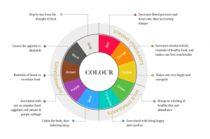
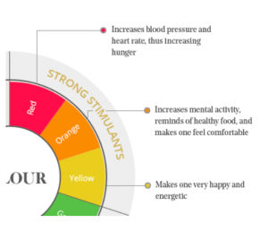
Strong Appetite Stimulants
Shades of red are all strong appetite stimulants. “Red is abundant in nature, and the brain’s reptilian response to it is a carryover from the days when our ancestors were still hunters and gatherers. Red, especially bright reds, would usually signal energy-dense, sugar-packed fruit or vegetables.”
Colors of red, orange, and yellow are the most appetite-stimulating colors and should absolutely find their way into your design.
Mild Appetite Stimulants
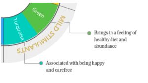
Green and turquoise are mild stimulants: “Green signals edible, benign, non-poisonous plants. However, these plants are merely fibrous, not sugar packed like most colorful fruit, which provide a jolt of energy. These days, green is also associated with health. This is unsurprising, given that most green things are fibrous and don’t have sugar.”
Although these colors are not as stimulating as the reds, they illicit beneficial feelings and associations. They particularly evoke feelings associated with health.
Appetite Suppressants
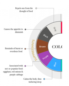
The rest of the colors on the wheel are appetite suppressants. Food does not commonly exist in nature in these colors, at least not food you would want to eat. As a result, these colors should be used sparingly.
Conclusion
The way we perceive and react to colors is deeply rooted in evolutionary biology. As such, its impact is relatively profound when it comes to our dining experience.
So, take a look at your restaurant. Identify colors that aren’t contributing to your design and replace them with something more suitable. Or, if you find that you’re not using much color in general, try to incorporate stimulating colors into your space.
Being intentional with the use of color is a simple way to improve the impact of your restaurant design and enhance your brand’s experience.